Staff Favorites
Working in an art gallery is like working in a candy shop for an artist and during auction season KCAC’s walls are literally dripping with artwork. Each year, the staff finds their favorite pieces that they covet and watch as bids accumulate. This year is no different. Here are a few of the Staff picks from the 43rd Annual Benefit Art Auction for the Kansas City Artists Coalition…
Thayer Bray, Exhibitions Director
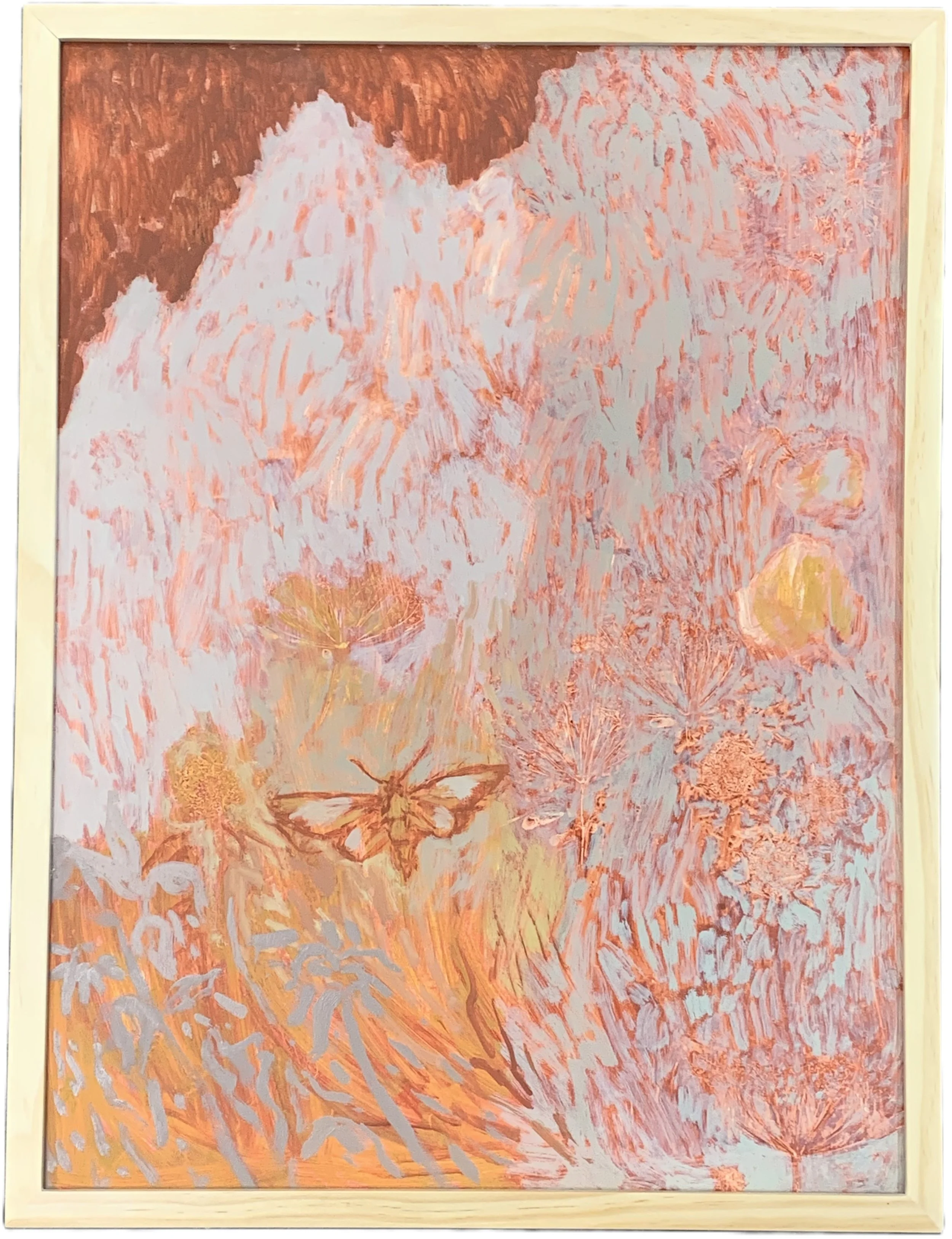
Late Summer by Erin Dodson, Oil on Panel, Valued at $700. Available only during the Live Auction, Saturday February 28
Late Summer, by Erin Dodson, drives me wild. There is so much going on in this medium-sized oil on panel piece. On first glance, it is built of confident, robust but contemplative impressionistic brushstrokes in warm earth and varied ash colors. This brushwork assertively push they eye around the painting to dance and percolate at the top, where craggy peaks of concrete gray are crenellating against a homey mud brown corner. A large sphinx moth commands attention with spread wings in the lower half of the composition; it is here that the eye is wrested from the powerful flow of brushstrokes, as the gray breaks up from short strokes to longer gestures, turning into plant signs: leafy stalks and flower capped stems.
These figures slow the eye down to push the eye into and behind the rush and into the intricacies of the delicate painting beneath. Stiff-bristled washes turning fields of warm autumnal yellows and oranges into a fibrillating agglomeration of individual lines and marks glimpsed between the robust brushstrokes, asserting their agency and persistence independent of, but still indivisible from, the corpus of the composition. Paled arc shapes, initially read as bare lines drawn through wet paint, emerge as pressed flower clusters, allium or wild carrot, further giving one the late summer feeling instilled by the underpainting color. More time with the painting reveals new interactions: the robust overpainted marks, initially understood as running wild over the underpainting, are very much sensitive to what goes on beneath. Rather than bowling over these delicate lines and shapes they are actively playing with them, mimicking their directions and temperaments above to behind. Even while writing this in the dead February grey, the piece gives me a truly visceral sense of the quiet humbling joy of walking in a wild field, the sun baking sweet grasses, delicate flowers, and my skin, as the blessing of breeze pulls the heat and brings a boquet of the world around.
Babs O’Halloran, KCAC Programs Director
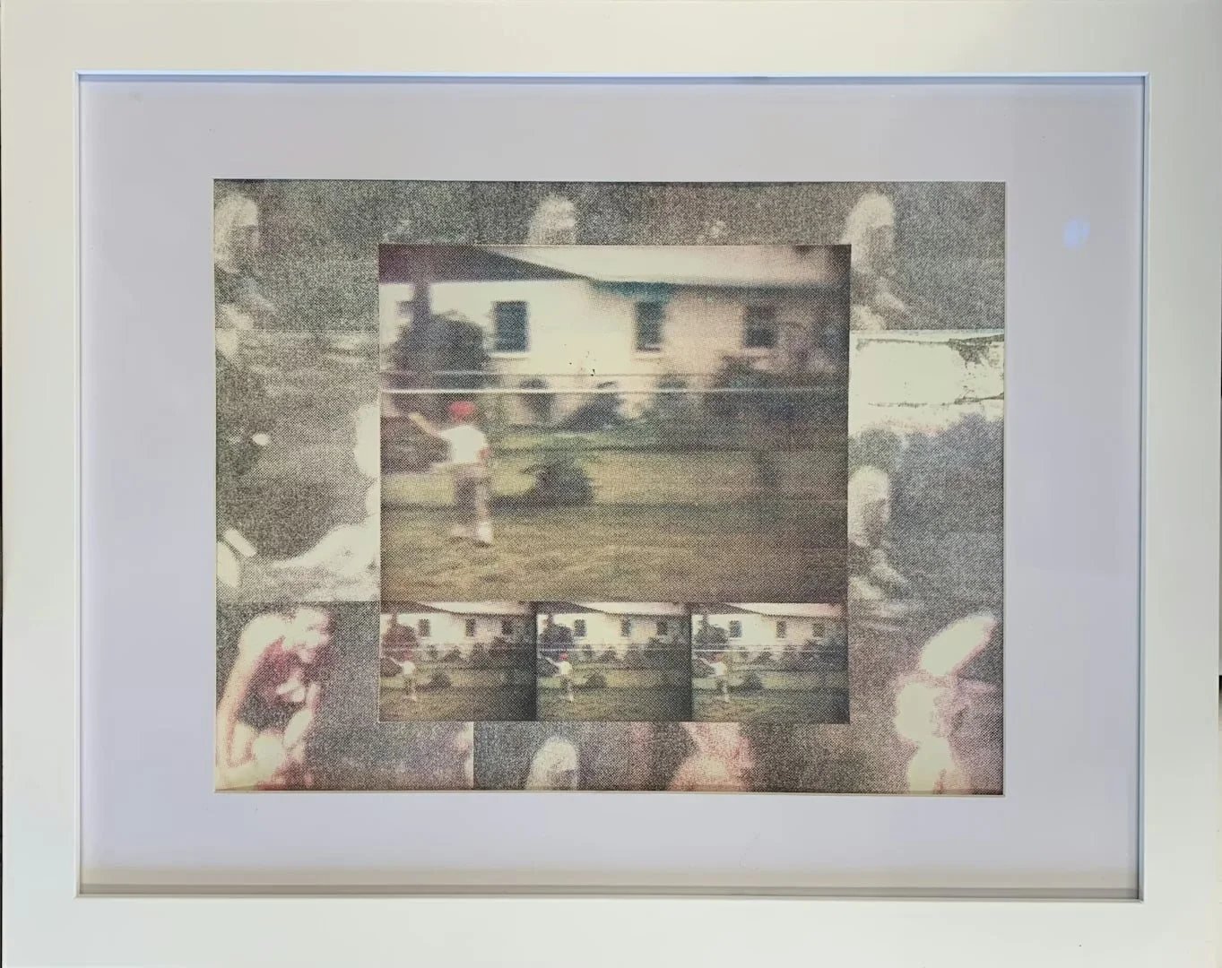
Florida Footage by Hannah Dixon Photolithography, 10 x 13 inches; Valued at $150
Florida Footage by Hannah Dixon is a favorite of mine not only because of my deep affinity for all things printmaking, but because it’s the kind of artwork I could live with—one that would continue to unfold in my mind long after I’d hung it on my wall. The use of old family film as both subject and material keeps me circling back to questions about the “truth” behind the figures depicted. Who were they, really, and what fragments of their lives are preserved—or invented—through this process
I’m often drawn to art that signals a story but leaves the narrative open, placing the responsibility of interpretation in my hands. Hannah’s photolitho print does exactly that. As I spend time with it, I find myself imagining the sensory world surrounding the moment she captured: the humidity of the air, the scent of sun-warmed grass or saltwater, the indistinct murmur of voices just outside the frame. I wonder what I might have heard or smelled had I walked past the scene unfolding in Florida Footage, and how those imagined sensations shape the story I build from the image.
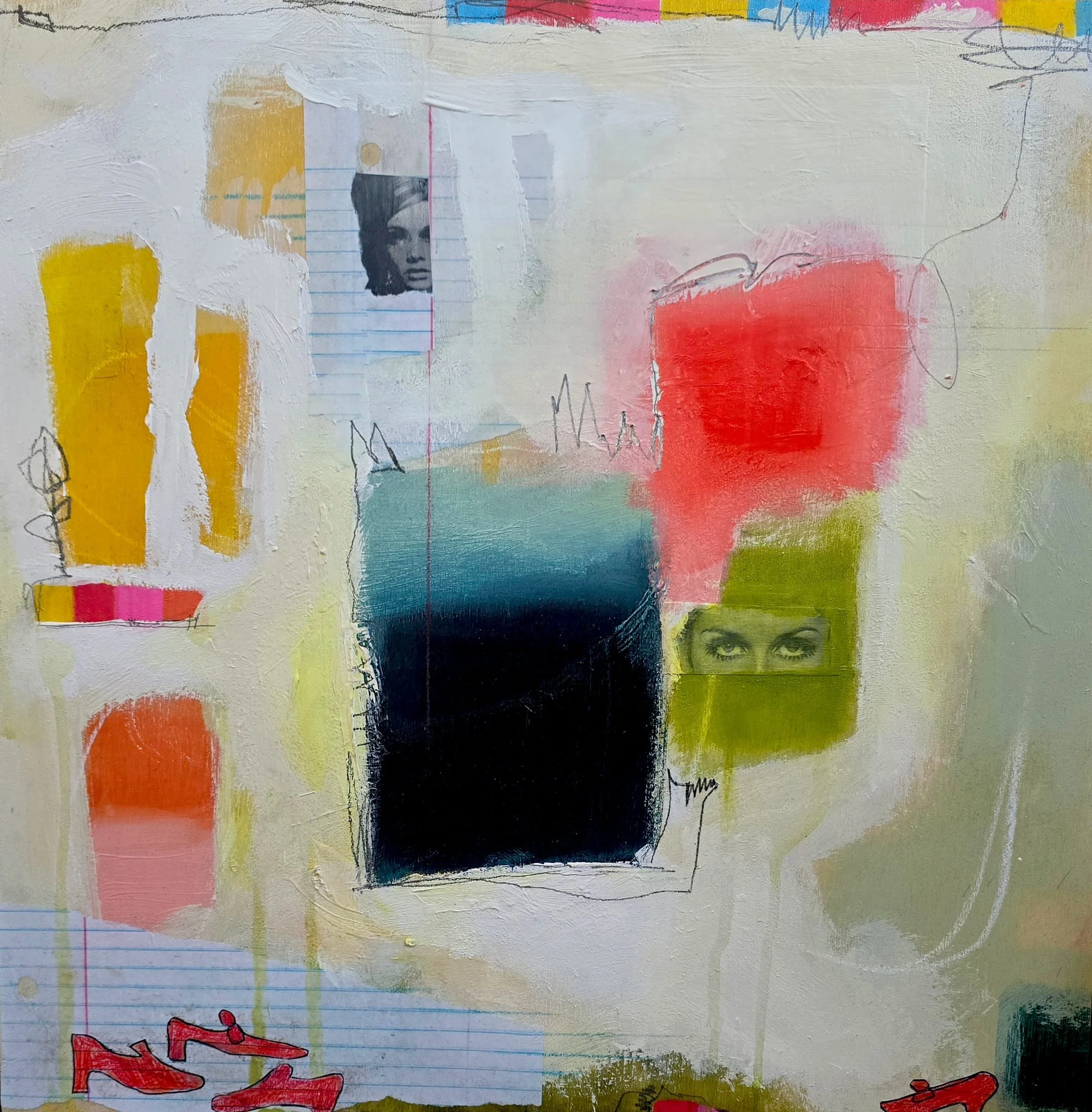
Put on Your Red shoes by Jennifer Bricker-Pugh; Mixed media, 16 x 16 inches Valued at $550
Put on Your Red Shoes by Jennifer Bricker-Pugh is another favorite of mine, and three qualities rise to the surface when I pause and consider why I’m so drawn to it. First, I’m captivated by the intentional preservation of the artist’s physical mark-making. The pencil lines etched into the once-wet paint feel like a quiet insistence on presence, gesture, and process.
Second, the work strikes a remarkable balance between the alluring and the comical. The “high brow vs. low brow” debate so often collapses under its own weight when applied to a single artwork, but not here. For Put on Your Red Shoes to hold my attention beyond a quick “stop and stare” while I’m working in the gallery tells me there’s far more happening beneath the surface—especially when the surface is literally gazing back at me. The humor of simple red shoes sketched on notebook paper sits comfortably alongside fragments of feminine features rendered with drama and poise. That tension, that conversation, is exactly the kind of debate I want to witness, and I’m not sure I even want to know who would “win.”
Third, my love of color and gradient is unstoppable. I’m a complete sucker for bold, confident color choices. For a long time, I didn’t consider this preference “noteworthy,” but I’ve come to realize it’s not just the palette itself—it’s the sense of conviction in how the colors are placed. The composition reads with such assurance that the color relationships become a defining factor in how much I enjoy the work.